

Killer Covers
Or Covers that Kill

Make no mistake about this: Everyone judges a book by its cover.

We do it unconsciously and without particularly wanting to, but whether we are in a bookshop or browsing on Amazon, it is the cover that first arrests our attention. Put more bluntly: covers can kill. The most compelling content in the world will go unread if it is ‘packaged’ inside a bad cover. Note: not just bad designs or offensive images kill sales; bland, neutral or utterly unoriginal covers are subtle assassins rather than brutal murderers. With between 8,000 and 10,000 new titles appearing every day, a book needs an outstanding, attractive, and appropriate cover just to survive.

Yet while almost everyone reading this likely agrees with what I’ve said, we also know that the ‘devil is in the detail.’ We know bad covers kill; we know good covers attract. But how, as authors, do we recognise the difference?
Getting the Right Kind of Attention
Finding the right cover entails both attracting initial attention and evoking a positive response from the target reader. While attracting the eye is the first step, it can easily be a step in the wrong direction. Anything loud, vulgar, or shocking will grab a glance, but it rarely converts to a purchase.

More tricky is the "mismatched" cover. A beautiful image may get a browsing reader to read the blurb, but if the picture has nothing to do with the content, it backfires. A disconnect between cover and content leaves readers feeling deceived; they will quickly put the book down. In short, there is no point in having a vampire or a scantily clad woman on the cover of a book that isn’t about vamps or romance. The goal is not to attract the greatest amount of attention, but the right attention—your target readers defined by age, education, and inclination.
Genre Shorthand
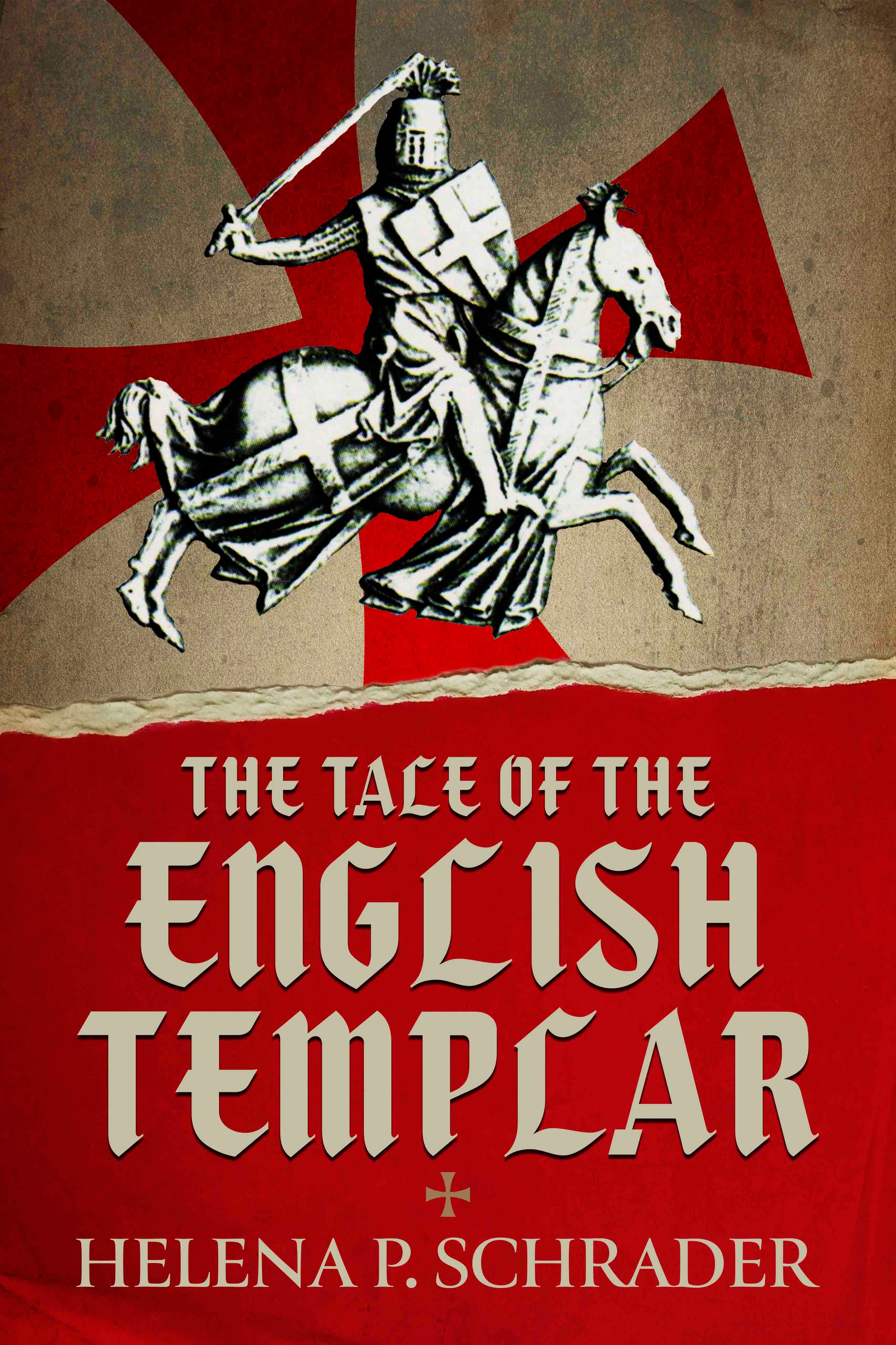
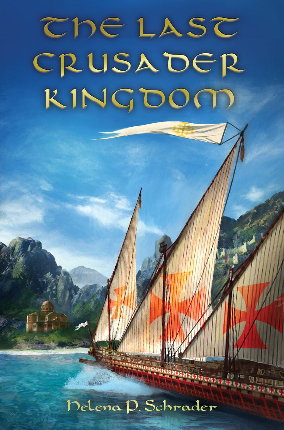
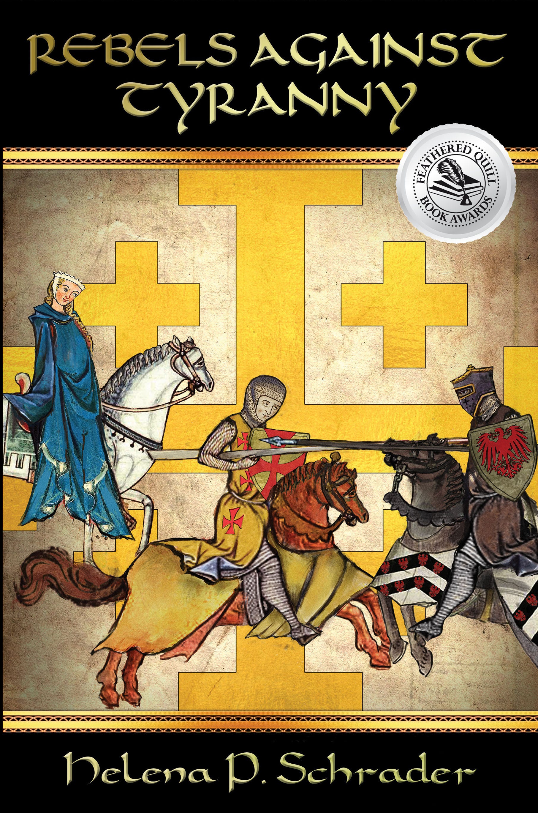
This need to target specific audiences—and to discourage those who wouldn’t like the book anyway—makes it best to build a design from the ground up. Furthermore, different genres have distinctly different characteristics. The public associates specific colours and fonts with specific stories. Horror books almost always use bold fonts and favour red and black. Fantasy often has a stylised feel with splashes of silver and gold. Science fiction favours spaceships over people, and galaxies over interiors. Historical fiction, my genre, requires covers that evoke the era and the geographic region in which the book is set.
The Historian vs the Designer
When I started publishing, I was naive enough to think publishers would automatically develop exciting covers for me. They did, but not always ones I could live with. Over the past two decades, I have found that outsourcing cover design to “professionals” produces results ranging from brilliant to disastrous.
One problem is that publishers and designers follow the trends. They like covers that look like everyone else’s. Whether it’s bold and abstract design, impressionism and pastels, or every single cover about WWII featuring a tiny Spitfire in the air over a scene with — hopefully it fits the story! — the Eifel Tower on it. The tendency for all covers produced by ‘the industry’ to be nauseatingly similar is almost enough reason on it’s own to self-publish!
The bigger problem is that publishers and designers are rarely historians. They often don’t know the difference between 11th- and 16th-century armour, or between a Lancaster and a DC4. Yet, a historical novelist is instantly discredited if the visuals are wrong. If a novel set in the 12th century features a 16th-century knight, or a photo of a transport plane is slapped on a book about strategic bombing, the reader assumes the author knows nothing of the subject. Why would a reader of historical fiction want to buy a book by an author who “obviously” doesn’t know history?

Less is More
This doesn’t mean you should design the cover yourself. Professional designers are essential because design is about more than content; it is about balance, spacing, and mood. A good cover is not overburdened. It is clear. It is evocative. It is dramatic. Those objectives can’t be achieved by crowding in a lot of visual and written information. As a rule, less is more. The challenge is selecting one or two elements that capture an entire era.

There are also times when the professionals really do “know best.” When I published my biography of General Friedrich Olbricht in Germany, my German publisher used a picture of Olbricht with a colour scheme that avoided “brown” to stress he was not a Nazi. I liked it, and it worked well in Germany.

However, for the English version, I had to accept the hard truth that “Hitler sells.” Putting a German general on the cover—even if it was “colour coded” green—would not sell copies in the English-language market. With inner reluctance, I approved a familiar image: Hitler showing Mussolini the bomb damage from the July 20 assassination attempt. Because the image is iconic, it immediately told the English-speaking audience exactly what the book was about. It attracted the right readers, and sales were excellent.

Even the professionals will admit (after a glass or two) that they often fail to anticipate reader reactions. Attracting buyers is not a science, but an art—and even masters make mistakes. If a book isn’t selling, take a second look at the cover. It is often the problem—and fortunately, it can always be changed.
Meanwhile, for my literary patrons, I’ve got a “sneak preview” of my forthcoming series Voices on the Wind. This is a novel in two parts: Book I: Assault and Book II: Siege.
Assault will be released later this year, and Siege will be published in 2027.
